Line Charts vs Candlestick Charts: Which to Use
June 26, 2026 · 5 min read
When you first open a trading platform, you're immediately faced with a choice: which chart type should you use? Two of the most common options — line charts and candlestick charts — look very different from each other, and they each tell a different story about price. Understanding which one to reach for, and when, is one of the most practical skills you can build as a developing trader.
What Each Chart Type Actually Shows You
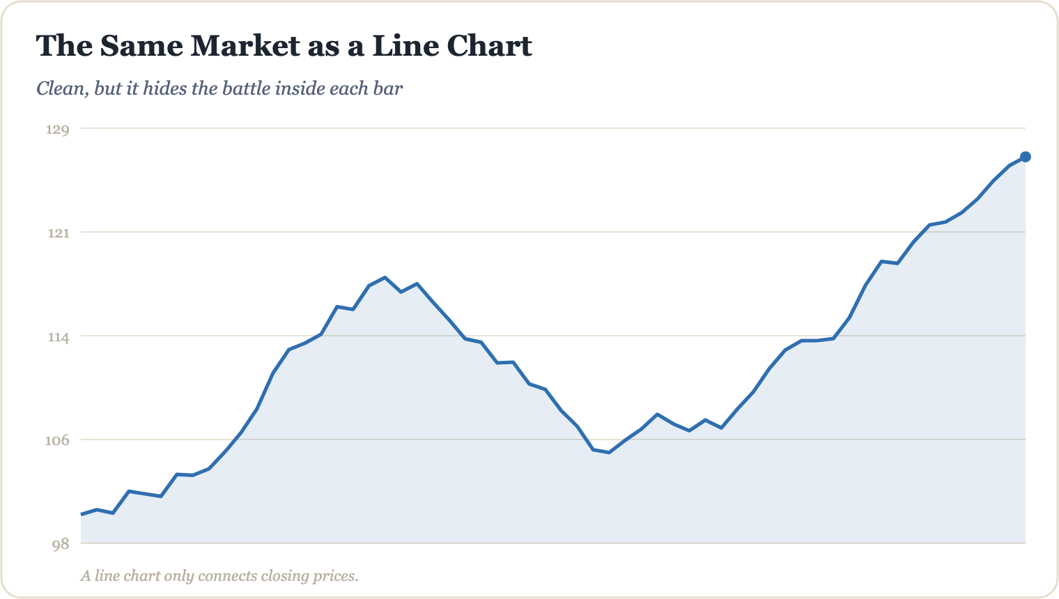
A line chart is the simplest form of price visualisation. It connects a series of closing prices with a single continuous line. That's it. No information about where price opened, how high it reached, or how low it fell during a session — just the close.
A candlestick chart, by contrast, packs four data points into every single bar:
- Open — where price started the session
- High — the highest point reached
- Low — the lowest point reached
- Close — where price ended the session
The "body" of the candle represents the range between open and close, while the thin "wicks" (or shadows) above and below show the high and low extremes. A green (or hollow) body means price closed higher than it opened; a red (or filled) body means price closed lower. This additional context is precisely what makes candlesticks the dominant chart type among technical analysts.
When a Line Chart Is the Right Tool
Line charts aren't inferior — they're just built for specific jobs. Their greatest strength is cutting through noise. Because they only plot closing prices, they smooth out intra-session volatility and make longer-term trends far easier to see at a glance.
For example, if you're trying to identify whether a stock like Apple (AAPL) has been in a sustained uptrend over the past 12 months, a line chart drawn on a weekly timeframe will show that trajectory cleanly, without the visual clutter of hundreds of individual candles. This makes line charts particularly useful for:
- Spotting macro trend direction quickly
- Drawing clean, unambiguous support and resistance levels based on closing prices
- Comparing multiple assets on the same chart without overwhelming detail
"The close is the most important price of the day — it's the price traders were willing to accept after all the session's noise had settled. A line chart honours that above everything else." — A core principle in price action reading
When Candlestick Charts Give You the Edge
For active traders analysing shorter timeframes — say, a 1-hour or daily chart — candlesticks provide context that a line chart simply cannot. That extra data (open, high, and low) reveals the psychology behind price movement, not just its destination.
Consider a real-world scenario: on a daily chart of EUR/USD, you notice a candle with a very small body but an extremely long lower wick. This pattern — often called a hammer — tells you that sellers pushed price significantly lower during the session, but buyers stepped in aggressively and drove it back up near the open. A line chart would show nothing remarkable about that day at all, because the close was near the open. The candlestick, however, signals a potential reversal worth paying attention to — though always with proper risk management and confirmation before acting.
Candlestick patterns that simply don't exist on a line chart include:
- Doji — signals indecision between buyers and sellers
- Engulfing patterns — suggest a potential shift in momentum
- Shooting star — indicates possible rejection of higher prices
None of these signals are guarantees. Markets are inherently uncertain, and no chart pattern eliminates risk. But they do give traders more informed starting points for analysis.
The Practical Answer: Use Both
The most effective approach isn't picking one chart type and ignoring the other — it's knowing when to deploy each. A common workflow among experienced technical analysts is to use a line chart on a higher timeframe (weekly or monthly) to establish trend direction, then switch to candlesticks on a lower timeframe (daily or 4-hour) to look for specific entry signals within that trend. This layered approach gives you the clarity of the line chart and the precision of the candlestick simultaneously.
Mastering these tools is just one piece of a much larger analytical framework. If you want to see how line charts, candlestick patterns, and other technical methods fit together into a structured, repeatable process, the full system is laid out step by step in The Millionaire Trader's AI Playbook — a practical guide built for traders who are serious about developing real, risk-aware skills.
Go from this article to a complete education.
The Millionaire Trader's AI Playbook — 200+ pages, English & Arabic.
Keep reading
How to Read a Candlestick Chart in 30 Seconds
Candlestick charts look intimidating at first — but once you know what each part means, you can absorb a market's story at a glance. Here's how to do it in 30 seconds flat.
Technical AnalysisThe Anatomy of a Candlestick Wick and What It Reveals
Candlestick wicks are more than just thin lines on a chart — they tell the story of rejected price levels, shifting momentum, and hidden market sentiment. Learn how to read them like a pro.
Technical AnalysisDoji Candles: Spotting Market Indecision
Learn how to read doji candles, understand what market indecision really looks like on a chart, and discover how traders use these signals as part of a broader technical analysis strategy.