How to Mark Support and Resistance Like a Pro
June 25, 2026 · 5 min read
Support and resistance are the backbone of technical analysis, yet most beginners draw them in ways that create more confusion than clarity. The difference between a novice and an experienced trader often comes down to how they mark these levels — not just that they mark them at all. Done correctly, support and resistance zones give you a structured framework for reading price action, planning entries, and — critically — managing your risk.
What Support and Resistance Actually Represent
At their core, support and resistance levels are areas of concentrated buying and selling interest. Support is a price zone where demand has historically overwhelmed supply, causing price to bounce upward. Resistance is the opposite — a zone where sellers have repeatedly stepped in and pushed price back down.
The key word here is zone, not line. One of the most common mistakes beginners make is drawing a single razor-thin line and expecting price to react to it with pixel-perfect precision. Markets are driven by human decisions, and humans are not precise. Think of support and resistance as a buffer zone — typically spanning several pips or points — rather than an exact price.
For example, if EUR/USD has bounced three times between 1.0780 and 1.0795, the support zone is that entire range, not a single line at 1.0787.
How to Mark Levels the Right Way
Here is a practical, step-by-step approach used by experienced technical traders:
- Start on the higher timeframe. Begin with the weekly or daily chart to identify the most significant levels. These carry the most weight because they represent the largest pool of market participants.
- Look for swing highs and swing lows. A valid level needs at least two — ideally three — clear touches where price has reversed or stalled. More touches generally mean a stronger zone.
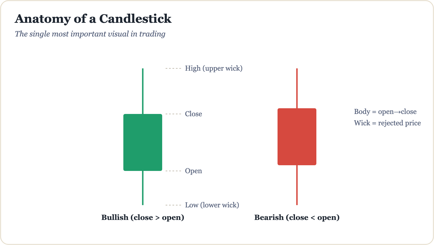
- Use candle bodies, not just wicks. While wicks show where price tested a level, candle bodies show where price was comfortable spending time. Mark your zones around the cluster of body closes for a more reliable reference.
- Drop down to confirm. Once you have identified a zone on the daily chart, drop to the 4-hour or 1-hour chart to refine the boundaries of your zone with more precision.
- Mark only the levels that matter. Avoid cluttering your chart. A clean chart with three high-quality zones is far more useful than one with fifteen questionable lines.
"The best traders don't have the most lines on their chart — they have the right lines. Clarity is an edge in itself."
Role Reversal: When Support Becomes Resistance
One of the most powerful concepts in support and resistance analysis is role reversal. When a support level is decisively broken to the downside, that same level often flips and becomes a resistance zone — and vice versa. This happens because traders who previously bought at support are now sitting at a loss, and when price returns to that level they often sell to break even, creating new selling pressure.
A practical example: imagine a stock that had strong support at $150. Price eventually breaks below it with high volume and falls to $138. When price rallies back toward $150, that level now acts as resistance. Traders who bought at $150 earlier are relieved to get their money back and sell — reinforcing the resistance. Spotting these role-reversals can provide high-probability areas to watch for potential setups, though no level guarantees a reaction. Always account for the possibility that price breaks through, and size your risk accordingly.
Common Mistakes That Undermine Your Analysis
Even when traders understand the theory, a few habits consistently undermine the quality of their levels:
- Drawing too many levels. If everything is important, nothing is. Be selective and prioritise zones with multiple touches on higher timeframes.
- Ignoring the timeframe hierarchy. A resistance level on a 5-minute chart is far less significant than one on a daily chart. Always put lower-timeframe levels in context of the bigger picture.
- Moving levels to fit a bias. Draw your levels before you form a directional opinion. Adjusting them after the fact to justify a trade is one of the most dangerous forms of confirmation bias in trading.
- Forgetting that levels are probabilistic, not guaranteed. Even the cleanest, most-tested support zone can and does break. Risk management — not level-marking — is what ultimately protects your account.
Mastering support and resistance is a foundational skill, but it is just one piece of a larger, structured trading approach. If you want to see how professional-grade level analysis integrates with entry triggers, trend filters, and risk management into one cohesive framework, the full system is laid out in The Millionaire Trader's AI Playbook — a step-by-step guide designed to help traders at every level build a disciplined, process-driven approach to the markets.
Go from this article to a complete education.
The Millionaire Trader's AI Playbook — 200+ pages, English & Arabic.
Keep reading
How to Read a Candlestick Chart in 30 Seconds
Candlestick charts look intimidating at first — but once you know what each part means, you can absorb a market's story at a glance. Here's how to do it in 30 seconds flat.
Technical AnalysisThe Anatomy of a Candlestick Wick and What It Reveals
Candlestick wicks are more than just thin lines on a chart — they tell the story of rejected price levels, shifting momentum, and hidden market sentiment. Learn how to read them like a pro.
Technical AnalysisDoji Candles: Spotting Market Indecision
Learn how to read doji candles, understand what market indecision really looks like on a chart, and discover how traders use these signals as part of a broader technical analysis strategy.